
The Monthly Edit: May Aesthetic

May Aesthetic:
butter yellow, vintage silver, and spring notes
There’s something about this time of year that makes everything feel lighter—our routines, our wardrobes, even our homes. After a season of deep tones and layered textures, April brings a breath of fresh air: longer days, blooming branches, open windows, and a quiet sense of newness.
This month’s mood is all about soft, sunny tones paired with grounded materials—think butter yellow and vintage silver, aged woods, and lived-in linens. It’s a mix of contrast and charm, old and new, structure and ease. A European countryside energy with a fresh California softness.


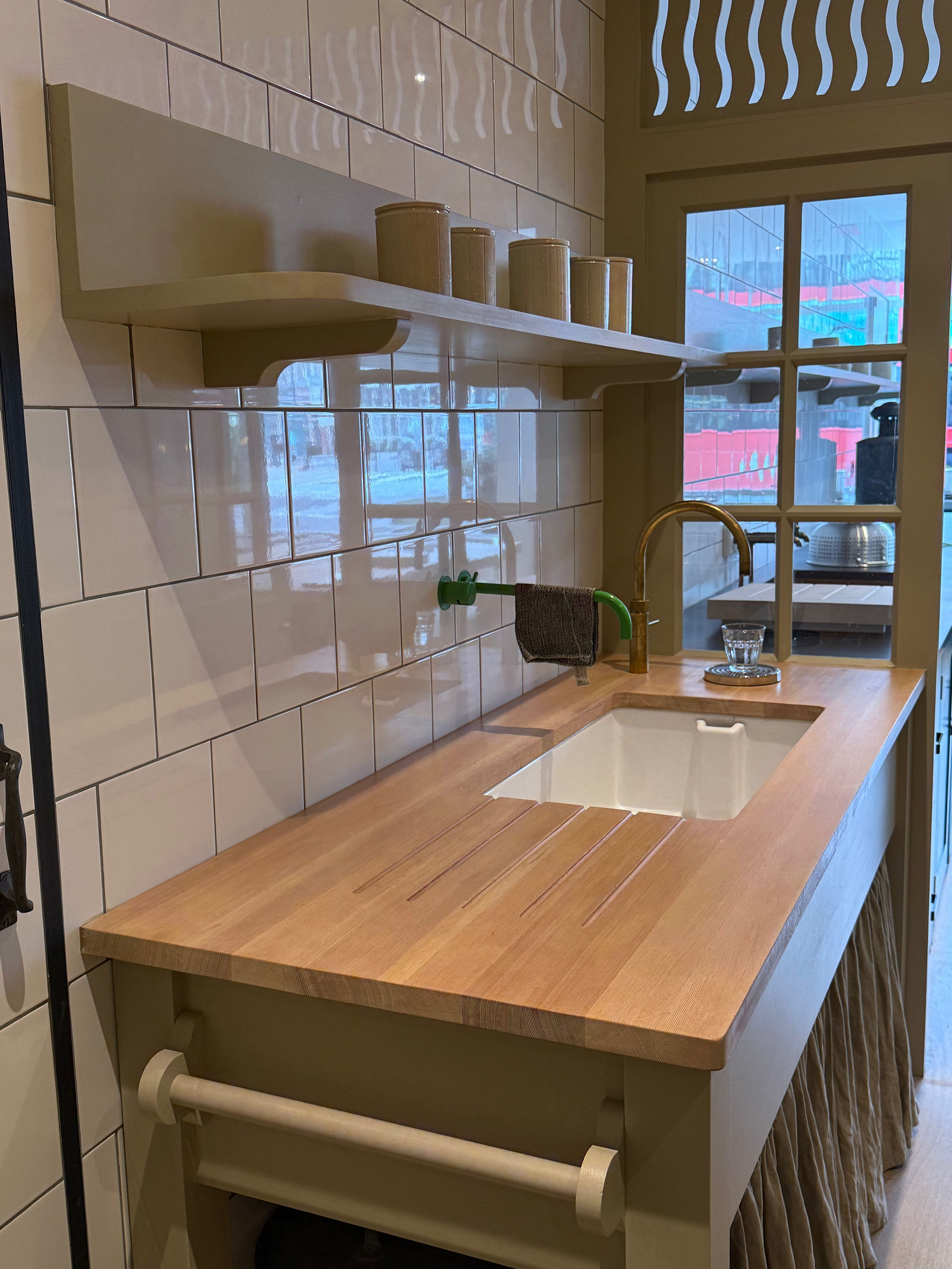
Butter Yellow...
Our color of the season
Butter yellow is showing up everywhere—and for good reason. It’s soft, understated, and quietly joyful. There’s a certain ease to it that feels just right for spring: a touch of warmth without being overpowering, a subtle nod to sunnier days ahead.
We’re drawn to it in both interiors and wardrobe—from woven linens and kitchen ceramics to tailored outerwear and everyday layers. It pairs beautifully with natural textures like oak, marble, and linen, adding a fresh energy that still feels grounded.
Whether it’s a painted cabinet, a vintage dress, or a tabletop detail, butter yellow is the kind of color that catches your eye, then settles in like it’s always belonged.


Vintage Silver The cool counterpart we’re pairing with everything
There’s something about tarnished silver that feels timeless, a little imperfect, and full of story. It’s the kind of material that elevates a room without trying too hard.
We’re styling it with simple spring florals, layering it into tabletop moments, and sourcing vintage pieces with patina and presence—ice buckets, serving trays, fluted vessels, even candlesticks. Whether polished or aged, it adds just the right amount of shine to a layered home.


thoitiethomnay.org mình thấy tiện hơn mấy app thời tiết mình từng dùng trước đây vì mở ra là chụp ngay được nhiệt độ hiện tại kèm “cảm giác như”, khỏi phải bấm qua vài màn mới thấy số; mình hay xem nhanh theo tỉnh nên cái mục chọn tỉnh thành đặt ngay trên trang khá hợp lý, bấm phát là nhảy sang đúng trang địa phương luôn, đỡ mất thời gian. Số liệu cập nhật trong ngày nhìn cũng yên tâm hơn. Mình chỉ cần lướt một chút là biết hôm nay ổn không. Font số nhiệt độ to nên nhìn phát hiểu liền. Ở dưới còn có mấy khối thông tin xếp gọn gàng với danh sách ô tỉnh…
rr88k1 com mình thấy mấy hôm nay nhiều người nhắc nên cũng bấm vào coi thử cho biết, kiểu tò mò thôi chứ không định ngồi lâu. Vào cái là mình để ý ngay giao diện chia theo từng khối nhìn khá thoáng, kéo xuống không bị “ngợp” vì thông tin không dồn cục lại một chỗ. Cái mình thích là menu đặt ngay chỗ dễ thấy nên chuyển qua lại giữa các mục nhanh, không phải mò vòng vòng mới tìm được chỗ cần. Mấy phần nội dung họ canh chữ với khoảng cách ổn, nhìn lướt vẫn nắm được ý chính. Nói chung dùng vài phút thấy nhẹ mắt, nhất là cách họ làm bố cục dạng block…
keonhacai.cam mình thấy mọi người nhắc hoài nên tò mò bấm vào coi thử giao diện thế nào thôi. Mình không có ngồi soi nội dung hay chọn trò gì cả, chủ yếu nhìn cách họ sắp xếp trang cho dễ hiểu không. Ấn tượng đầu là bố cục khá thoáng, các mục được gom theo nhóm nên lướt một vòng là biết mình đang ở đâu, không bị kiểu rối chữ. Mấy phần thông tin hiển thị theo dạng khối với bảng cột nhìn gọn, đọc nhanh cũng ổn, nhất là khi chỉ muốn xem sơ qua. Menu để chỗ dễ thấy nên chuyển qua lại giữa các mục cũng không phải tìm lâu, kiểu dùng vài phút là…